Reliable Tech, Human Energy
Gedatek
ABOUT
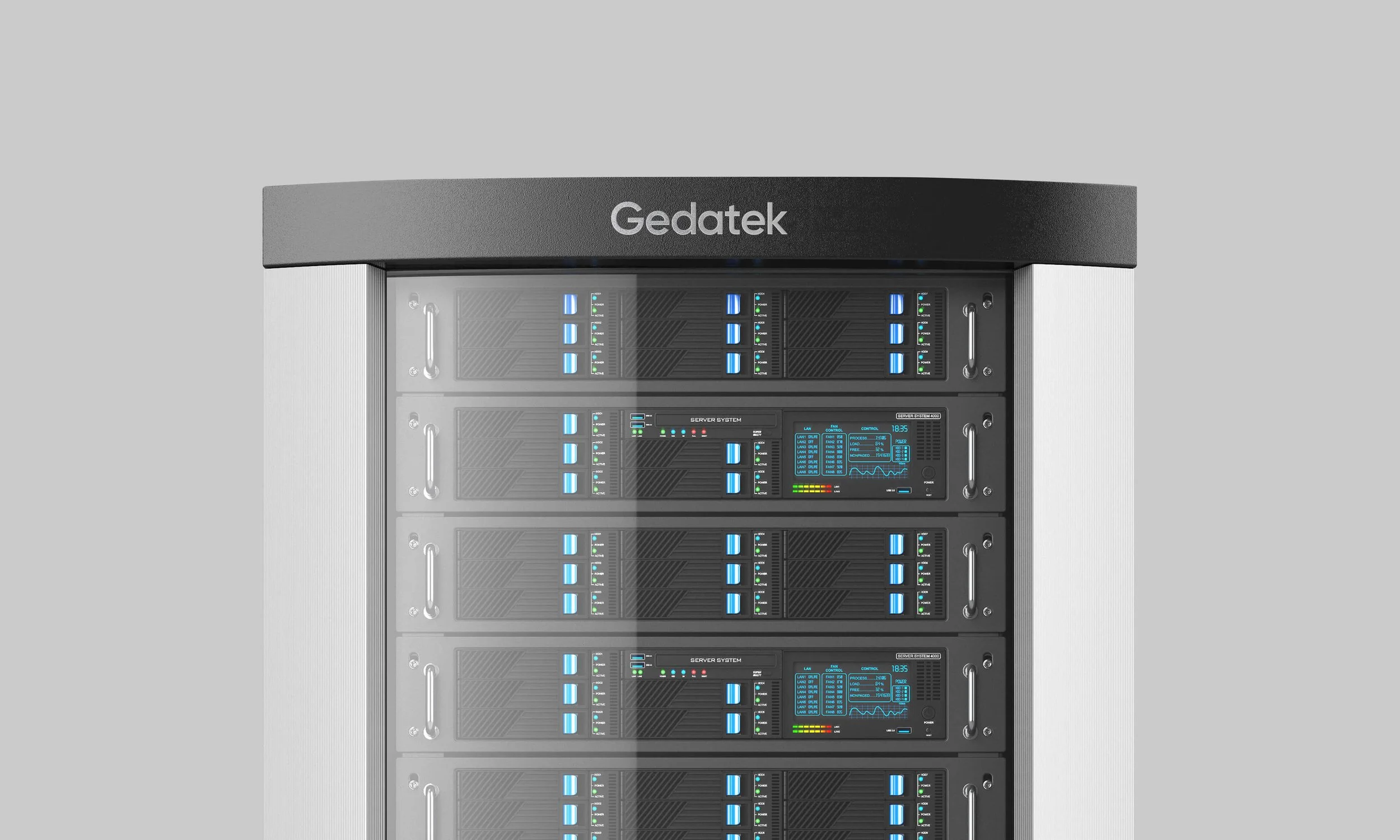
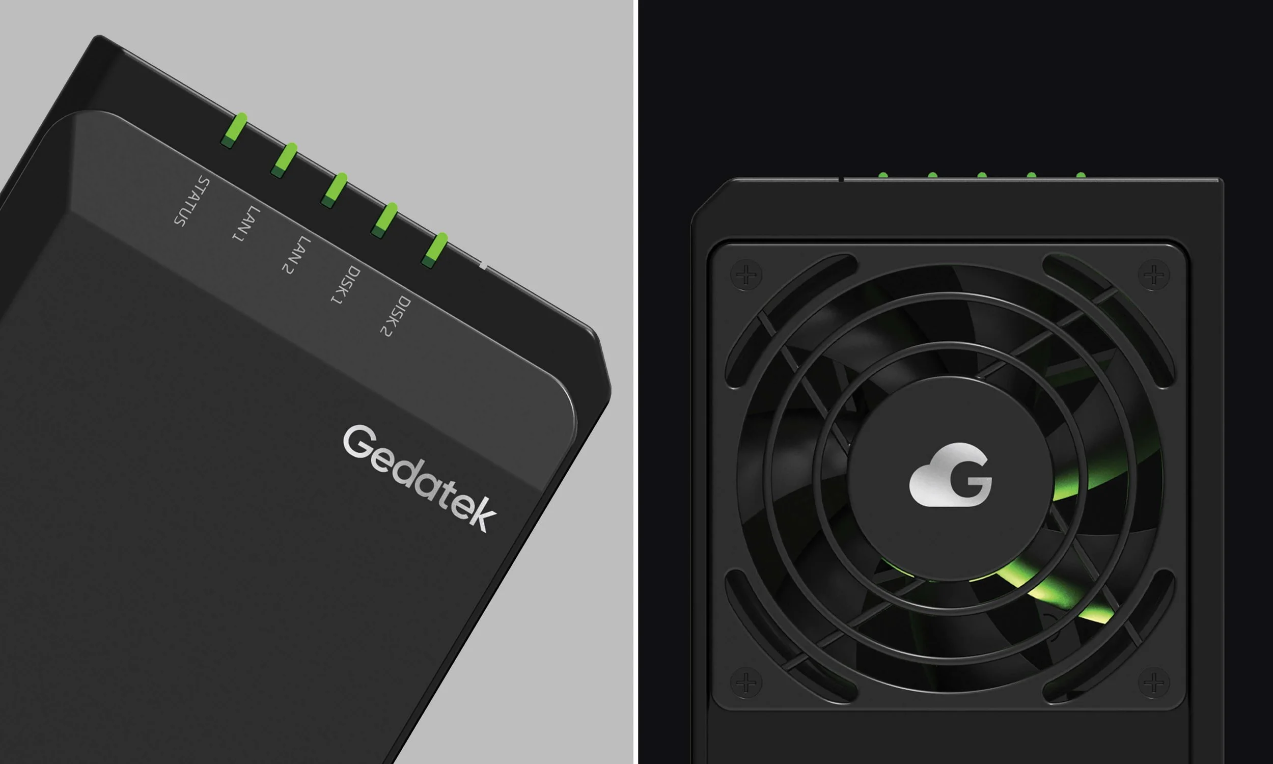
Gedatek specializes in providing companies with high-quality servers and storage solutions tailored to their unique business needs. Their product range includes cutting-edge server technology, cloud-based storage solutions, and network storage devices. With a team of experts with years of experience in the field, Gedatek helps clients navigate the complex world of IT infrastructure to find the best solution for their organization.
CHALLENGE
The enterprise IT and server infrastructure space is dominated by brands that lean heavily on cold, purely technical visual language. Gedatek needed an identity that communicated deep technical expertise and reliability, while still feeling energetic, human, and approachable — distinguishing it from a market where most competitors look interchangeable.
SOLUTION
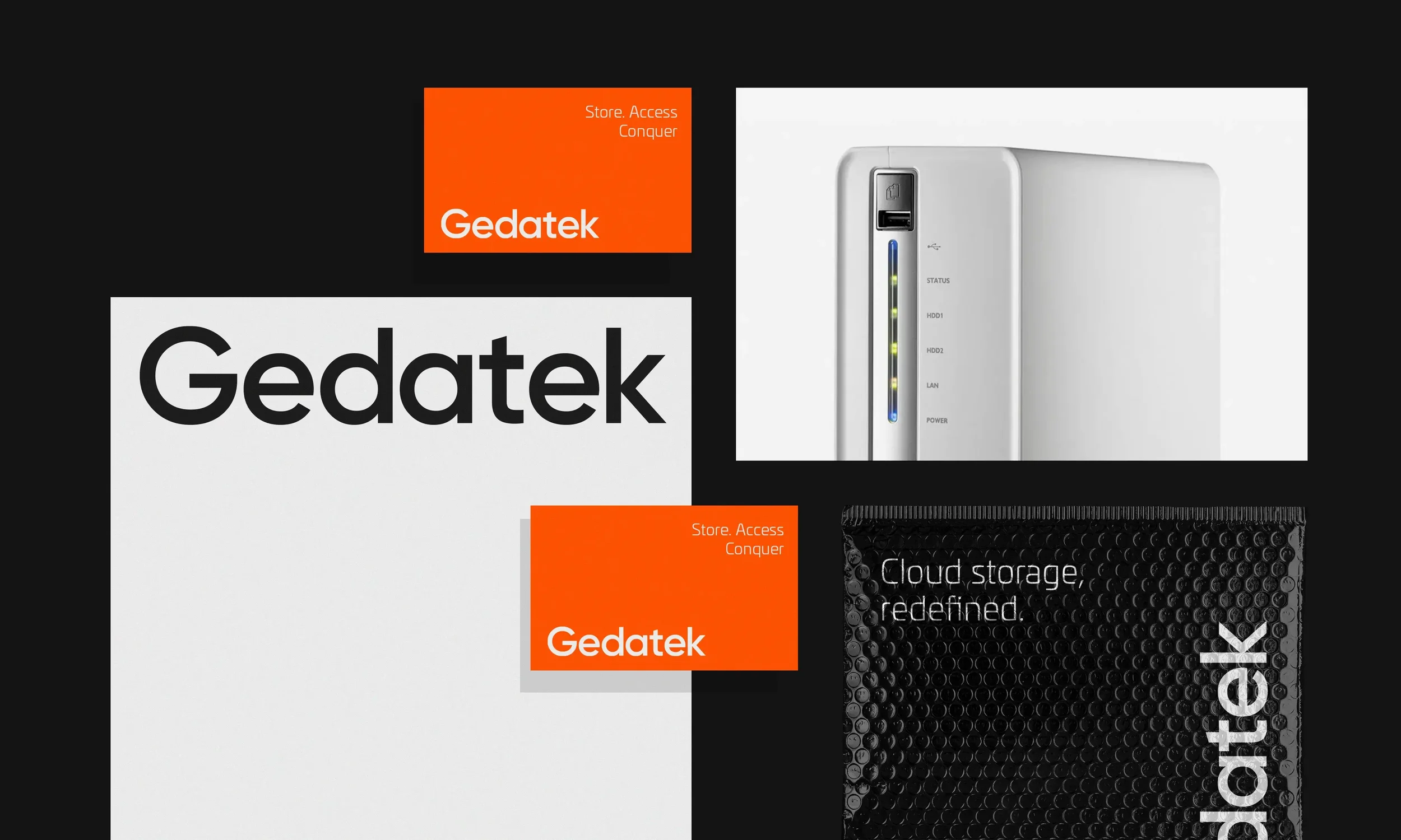
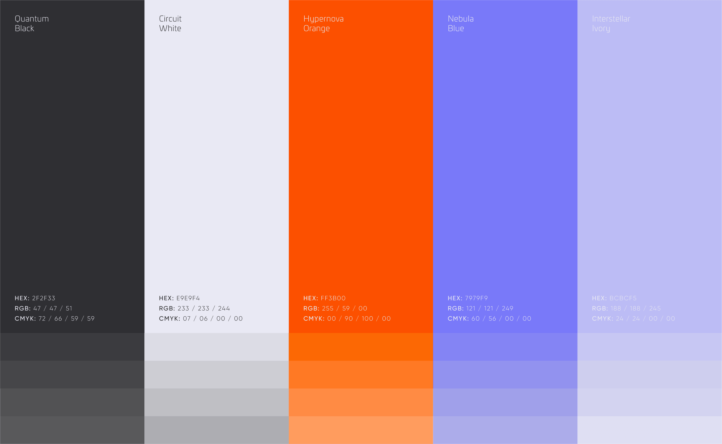
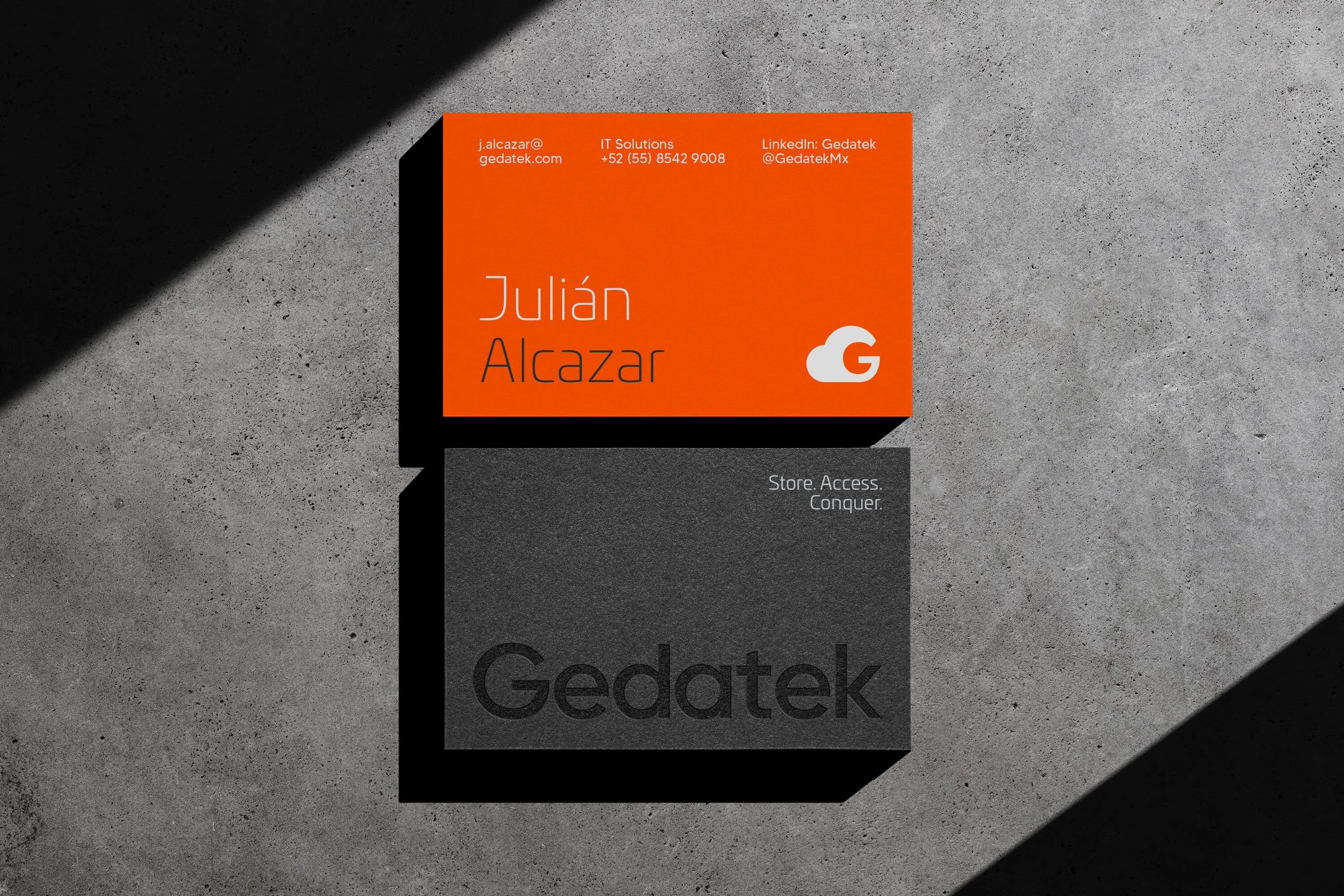
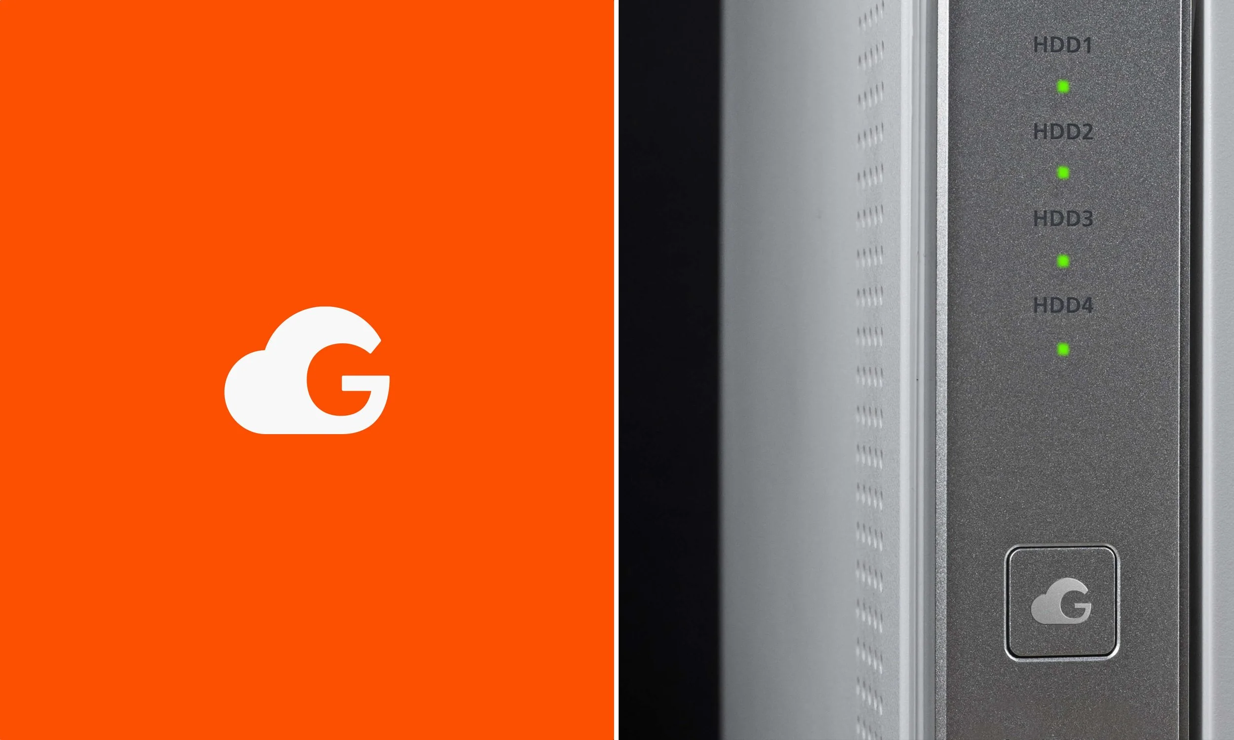
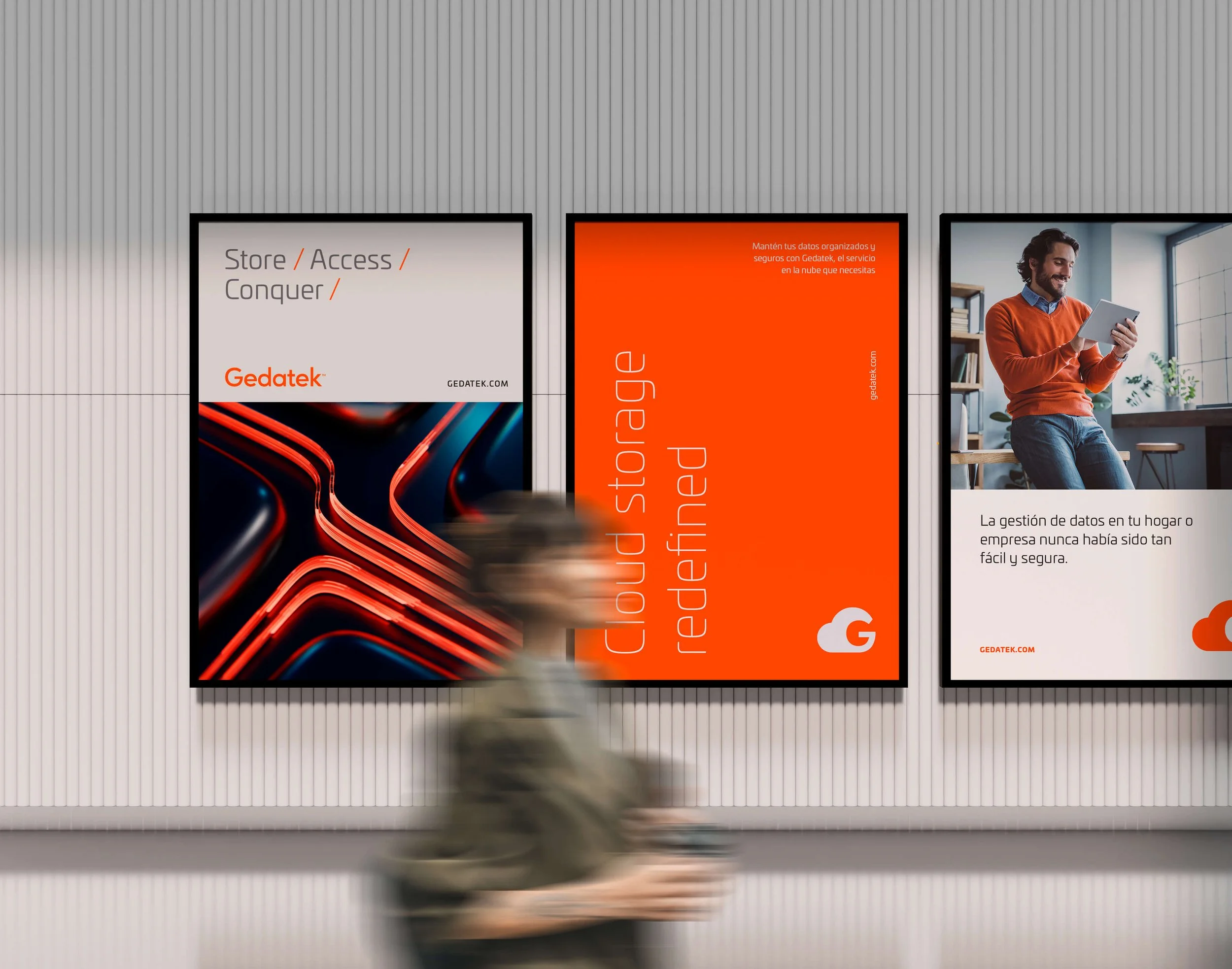
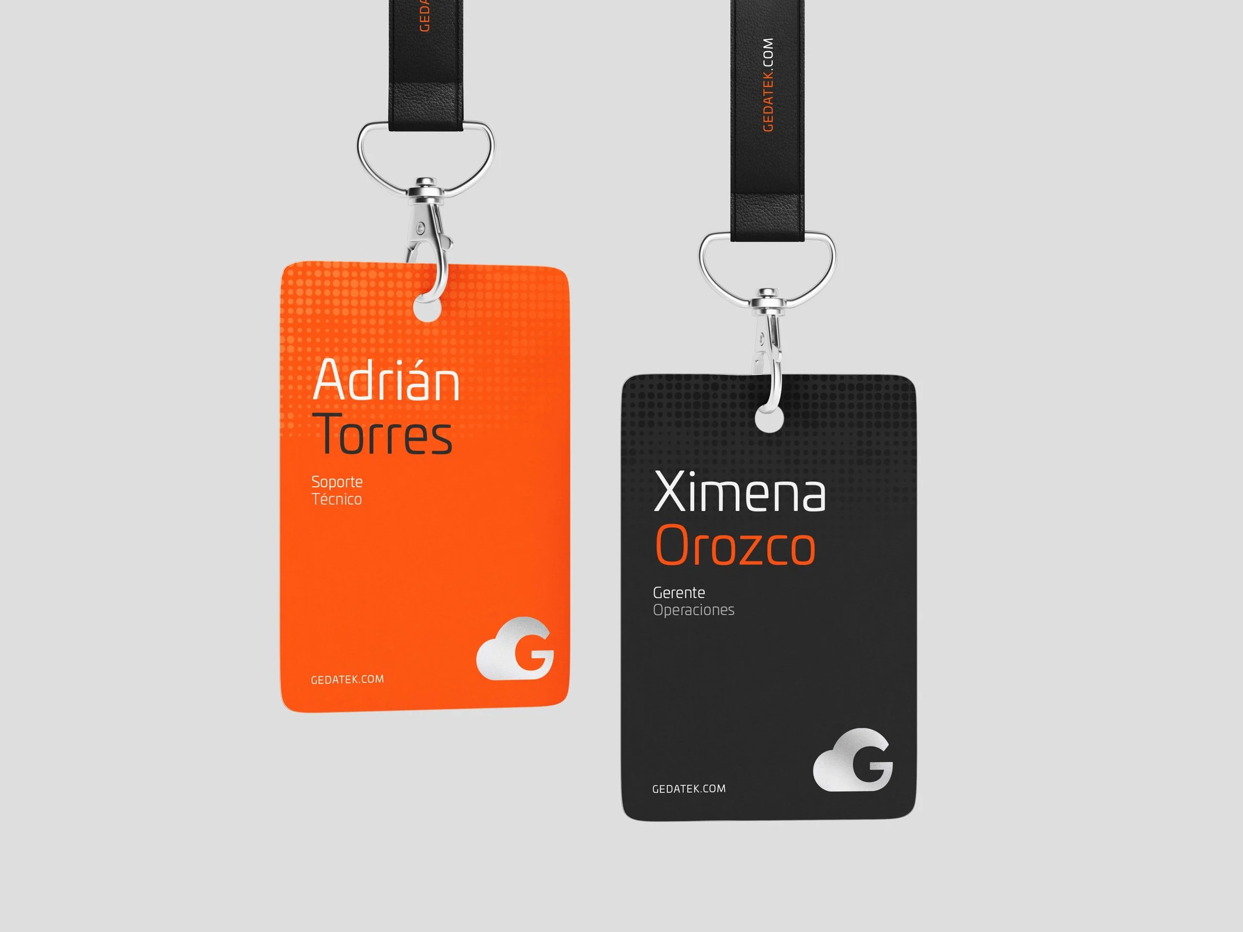
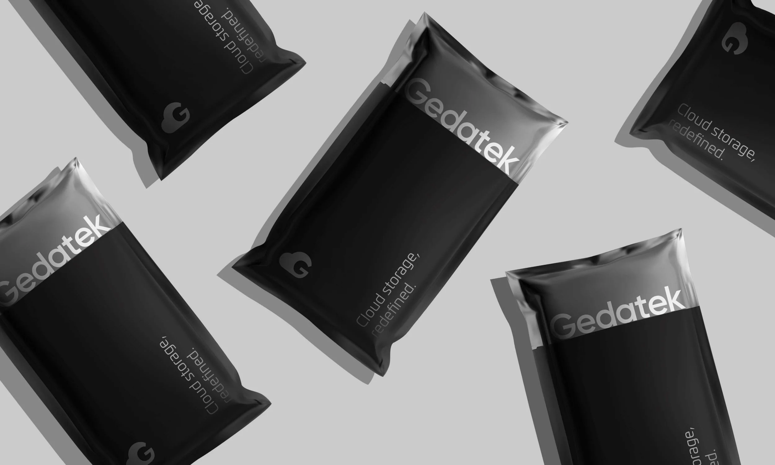
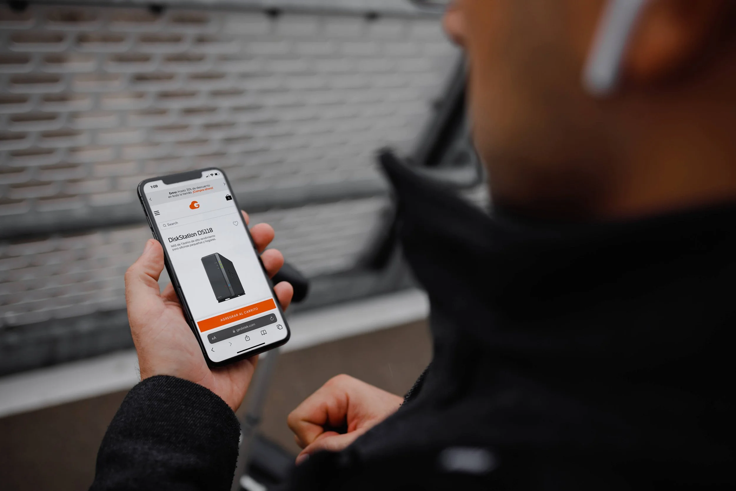
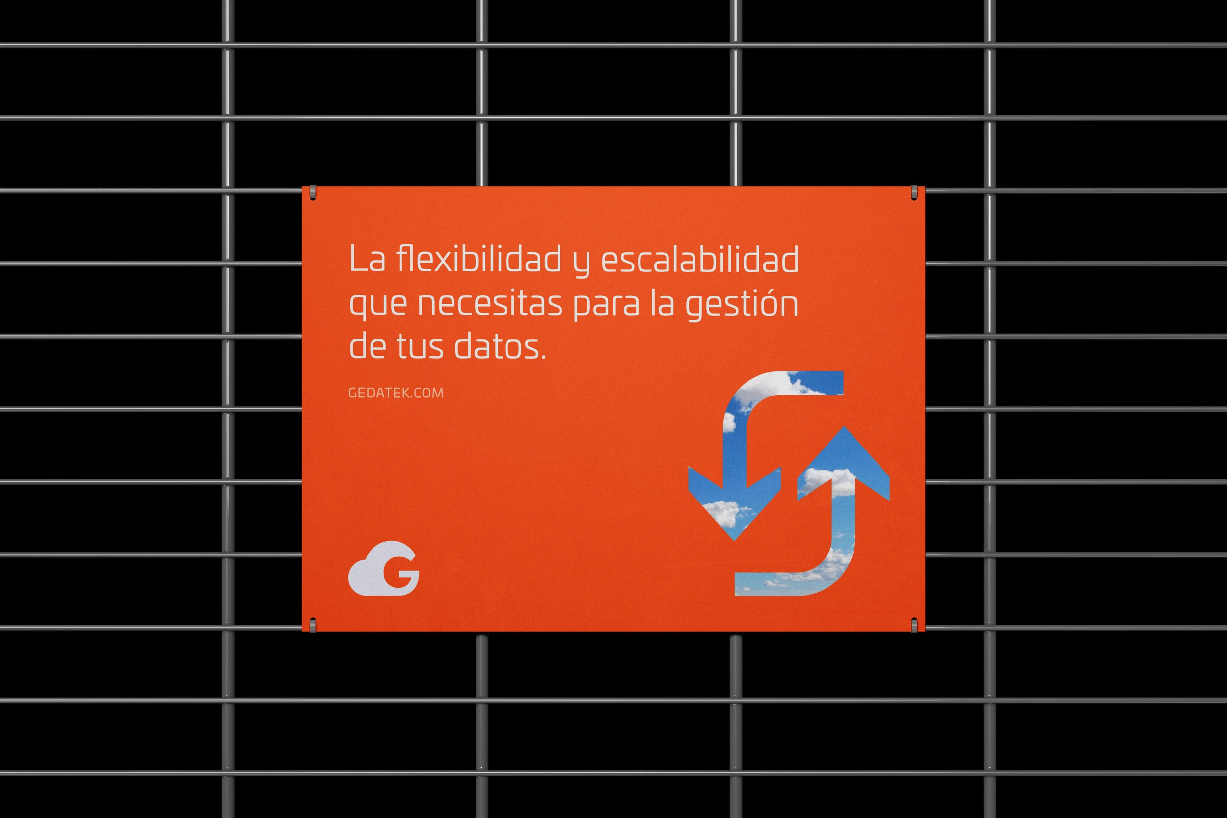
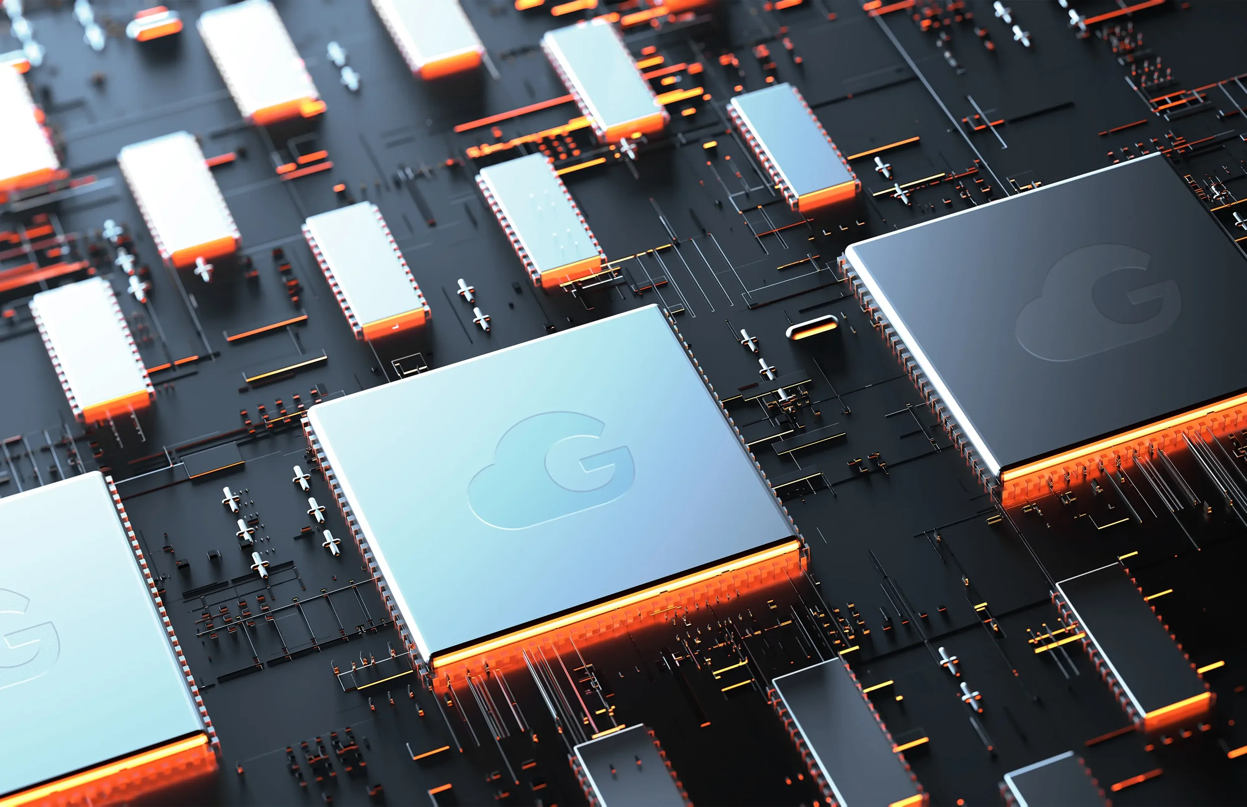
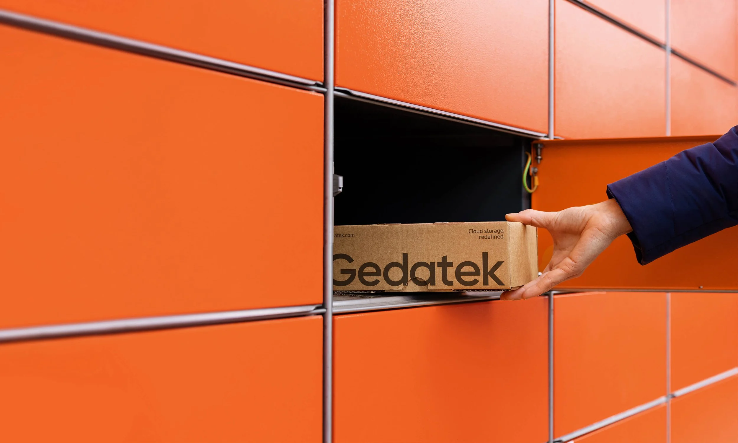
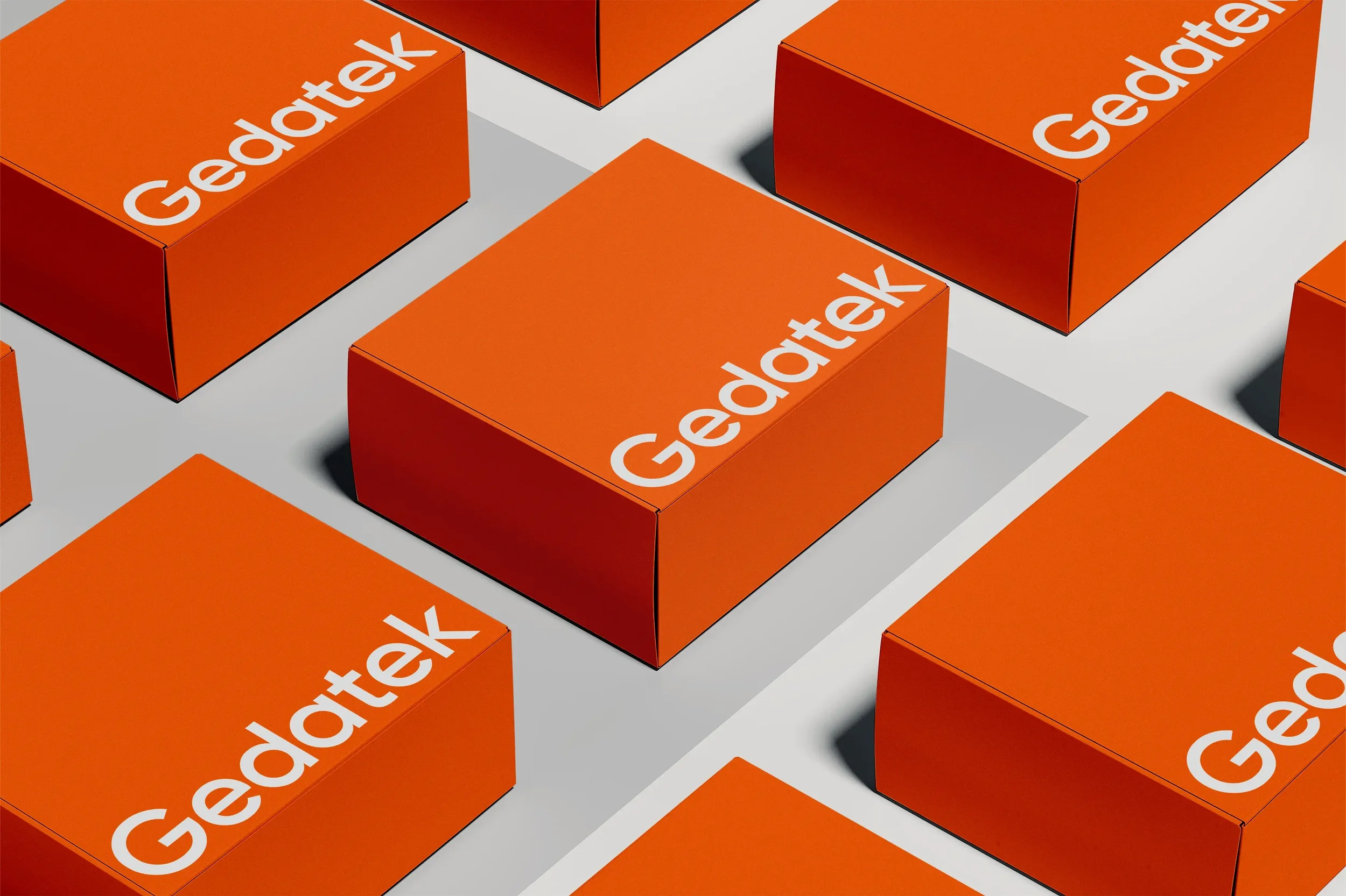
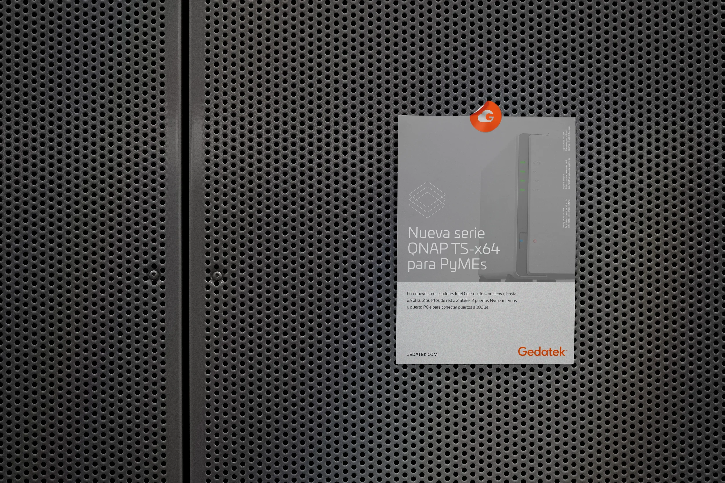
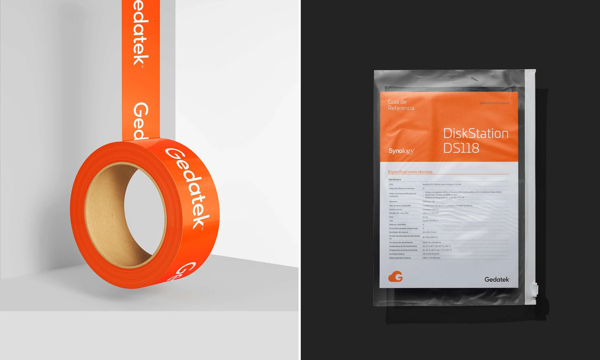
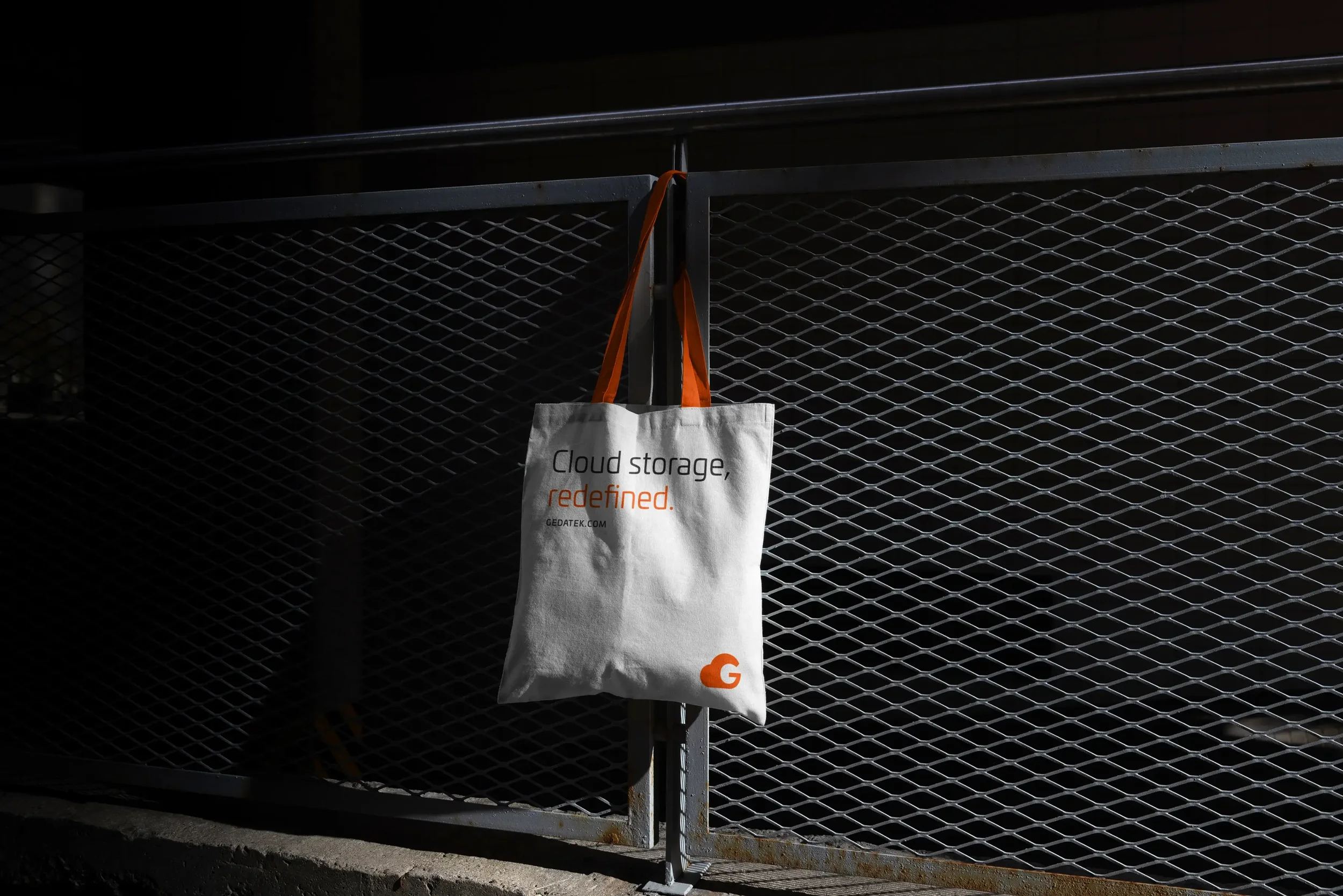
We developed a brand identity for Gedatek that reflects their expertise in server and storage solutions. We chose a logo with a cloud integrated into the letter G, using orange as the primary color and charcoal black as contrast. This design conveys innovation, creativity, and energy while highlighting the company's professionalism and expertise. The simplicity and versatility of the logo make it easily recognizable and memorable, helping the brand stand out in a crowded market.
Client
Gedatek
Services
Brand Identity
Applications
Art Direction
Industry
IT & Cloud Infrastructure